Project Spotlight:
250 Alexander Street & Mindex Technologies, Inc.
The modern office has come a long way. Oceans of beige “cube farms” have given way to fresh designs reflecting the dynamic work personality of the twenty-first century. The successful office of today considers how employees work best, both in collaboration and through individual focus. Flexible, adaptable environments full of color and light, have become the norm to attract and retain the best talent. Open and fluid, spaces provide easy pathways for communication and teamwork while offering dedicated spaces for concentrated, intensive work.
Project Background
Since 1994, Mindex Technologies, Inc. has provided software programming, IT support services and full life-cycle application development, to clients ranging from small local businesses to Fortune 100 companies. Having grown to more than 200 employees, they outgrew their old space. Edge Architecture was chosen to create a new office in downtown Rochester, to both reflect the company’s technology-based work culture, and accommodate their functional space needs.
Edge provided architectural design for the building as a whole, as well as the interior space for Mindex. Edge Building and Construction was the general contractor for Mindex’s office fit out.
Exterior Design
Functional requirements are just a list of “things to be included.” The design in which those requirements reside is where art and purpose can form a beautiful union, success is rooted in a clear understanding of context.
Every site has a list of factors for consideration. Fixed features like existing buildings, roads, landscape, and natural elements, will all influence design. Furthermore, ethereal considerations like the feel and direction of the neighborhood, go a long way to informing a forward-looking design, while preventing something that will look dated too quickly. When these dynamics are well balanced, a new construction should look like the final piece of a jigsaw puzzle. At the same time, a successful design should be both exciting for its freshness while looking like it was always meant to be there.
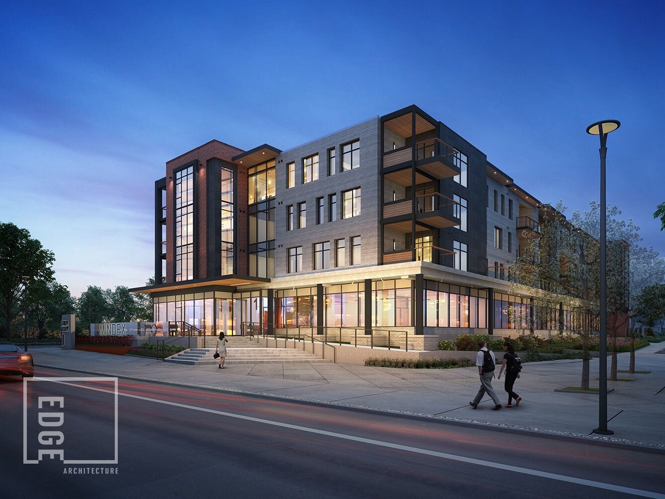
Edge designed the building in a holistic manner, combining the technology focus and community values of the client, with sensitive, modern urban design principles. As one of the first new-build mixed-use buildings in the City of Rochester’s Downtown Innovation Zone, the design focuses on established ideologies of urban planning and contextual design.
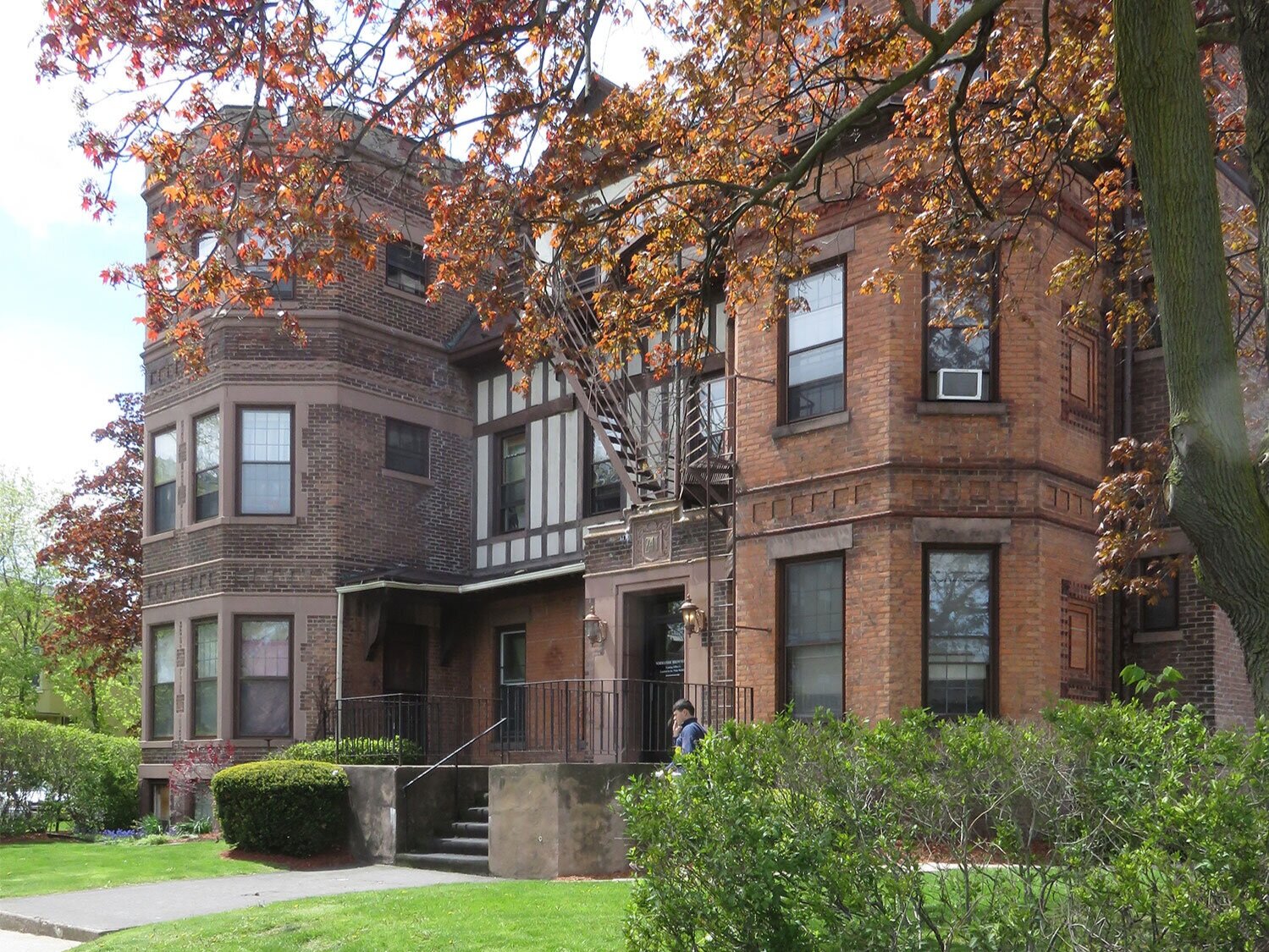
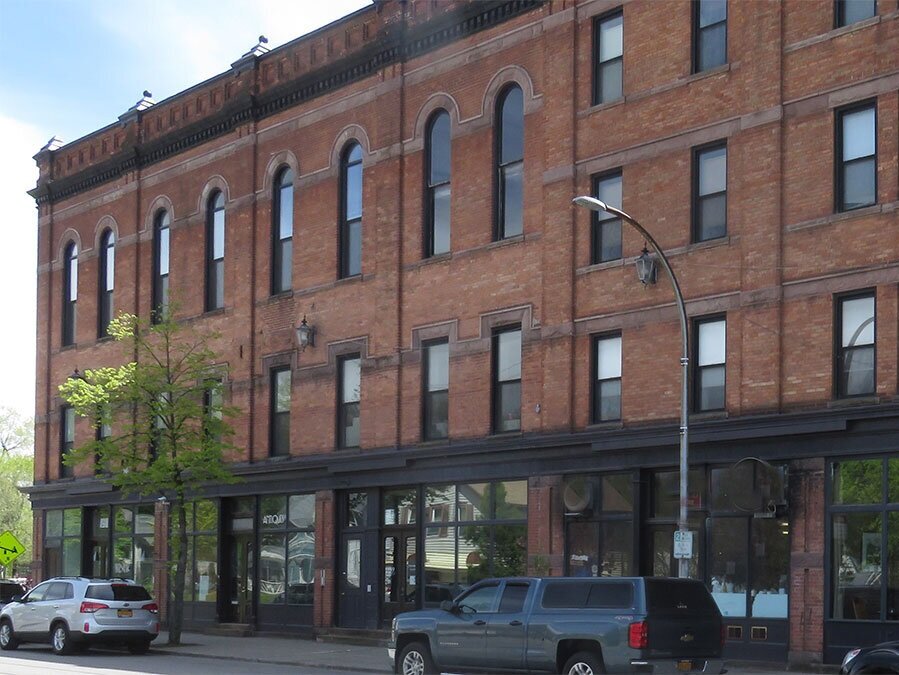
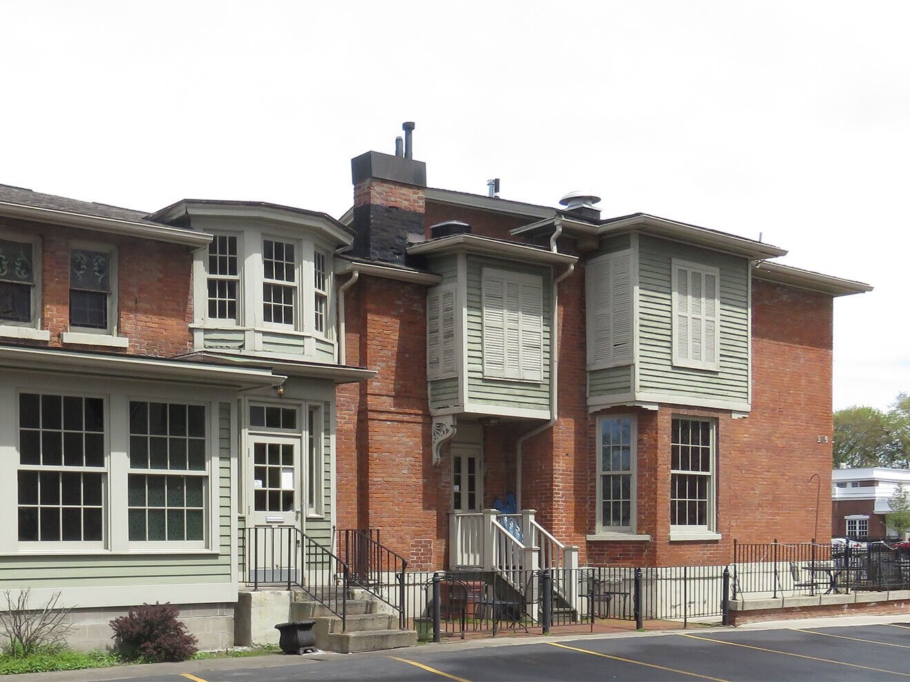
Inspiration was drawn from the local neighborhood details, including brick tone, punched windows, and the inclusion of front porches. The intent was to create a modern yet timeless building while remaining complementary to existing structures.
At 78,000 sq. ft., this 4-story, mixed-use building’s design reflects the history of the local neighborhood while acknowledging its urban location. Mixed materials including: wood siding (for its neighborly residential attributes), masonry (with color inspired from stone), and contrasting dark metals (to add a contemporary but timeless feel) result in a look that breaks up the overall mass while adding visual interest.
Porches are recessed and decks extend out. Even the windows have a little design flair… first, they are set back in the brick to complement the material to which they are married, but they vary in size and location, resulting in a musical rhythm, like keys of a piano. The building meets the sidewalk by way of exterior patios and stairs, while providing privacy and security with the main level raised above the street. Careful consideration was given to the scale of the interface with the public as well as the height of the building that creates the exterior pedestrian space at the street.
Work-life Integration
The average American office worker spends nearly six hours a day at a desk. Incorporating workplace wellness practices such as more natural light and offering indoor/outdoor work areas, improves health and overall productivity, while adding inspirational variety to the work day.
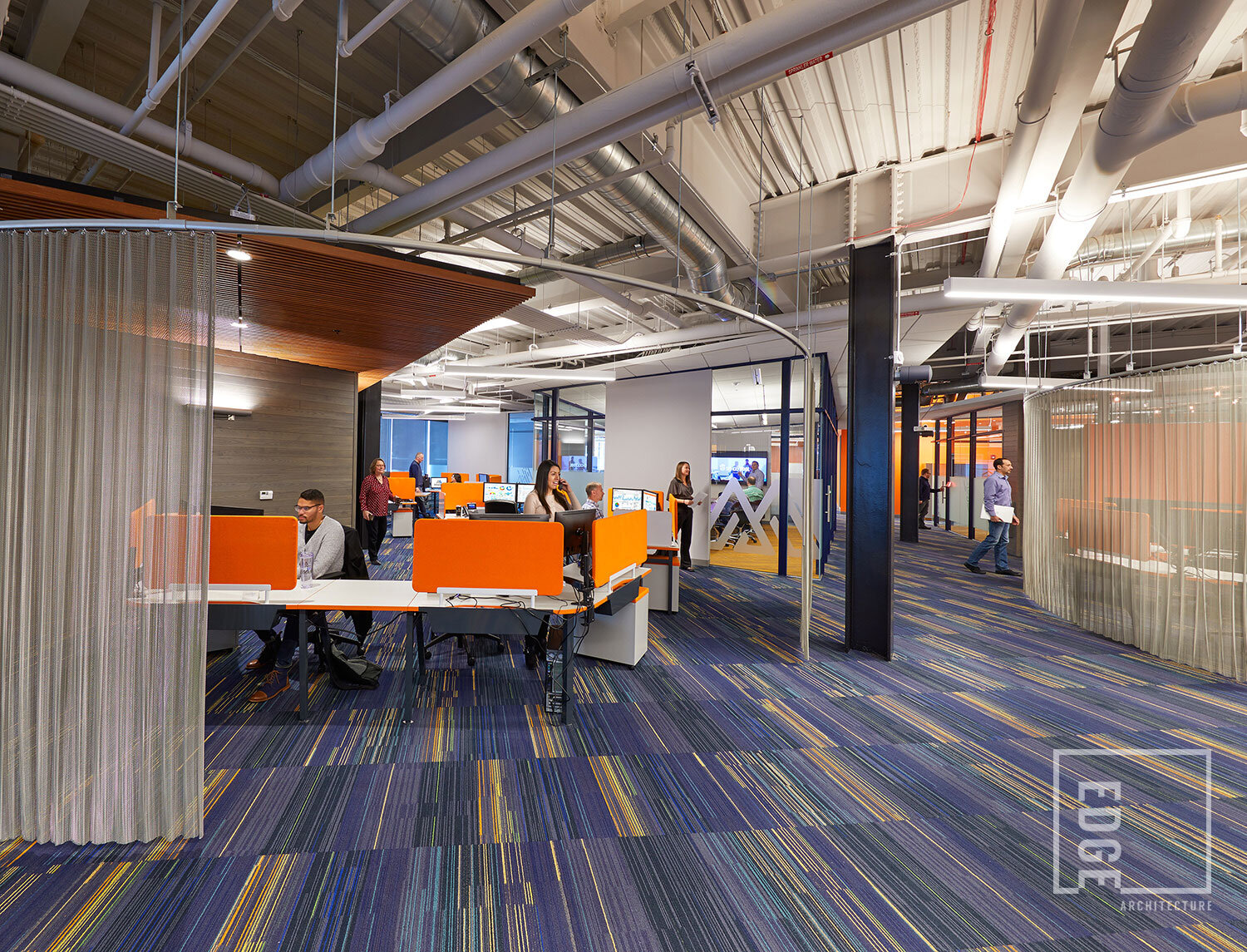
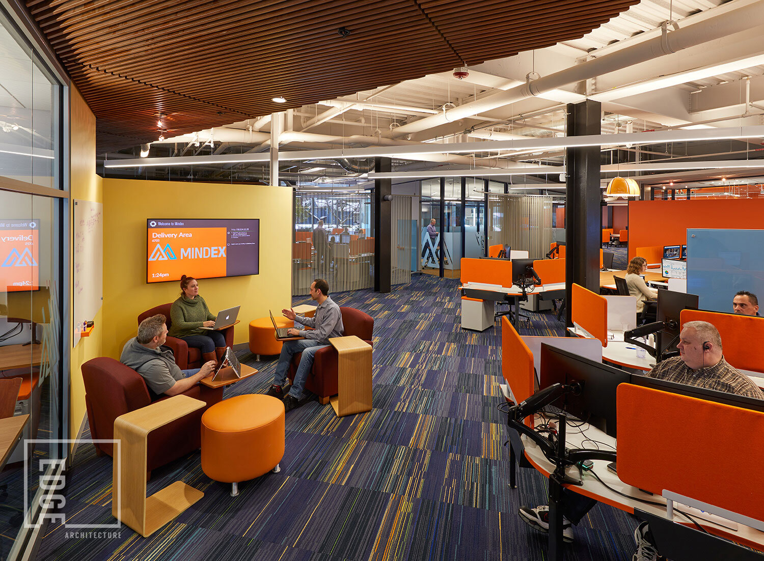
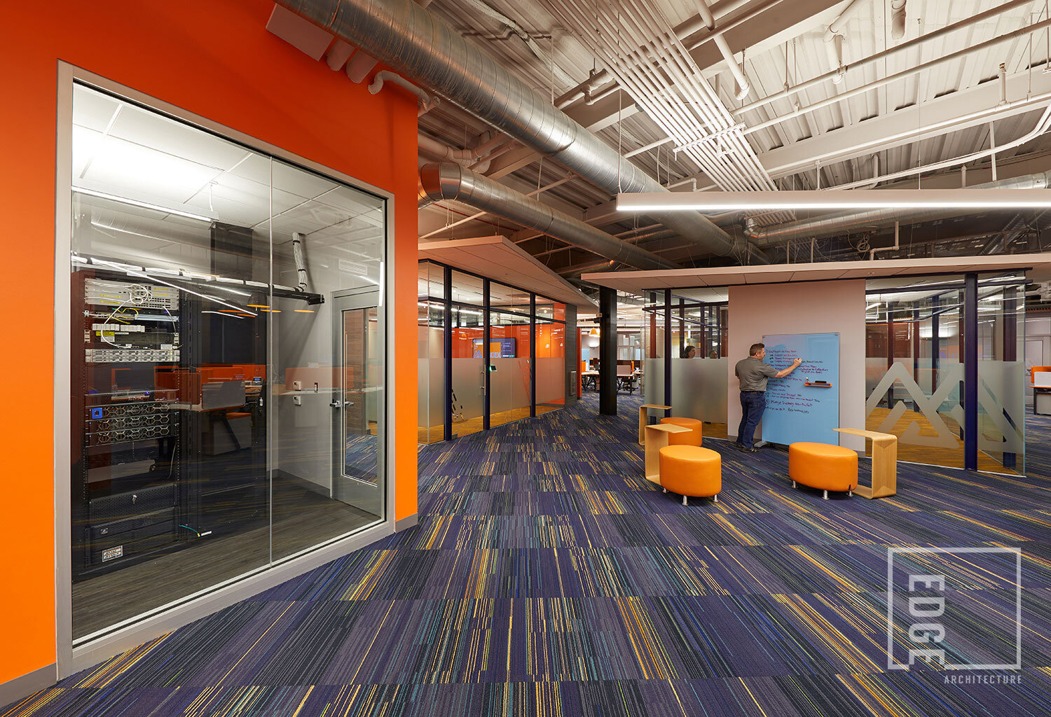
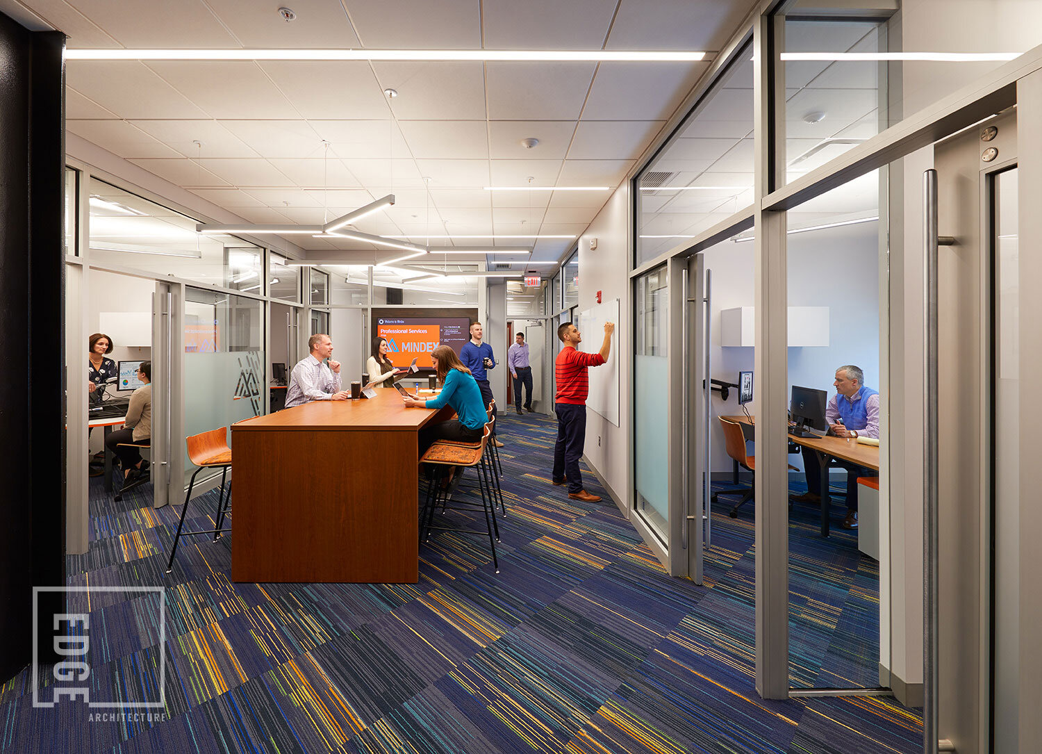
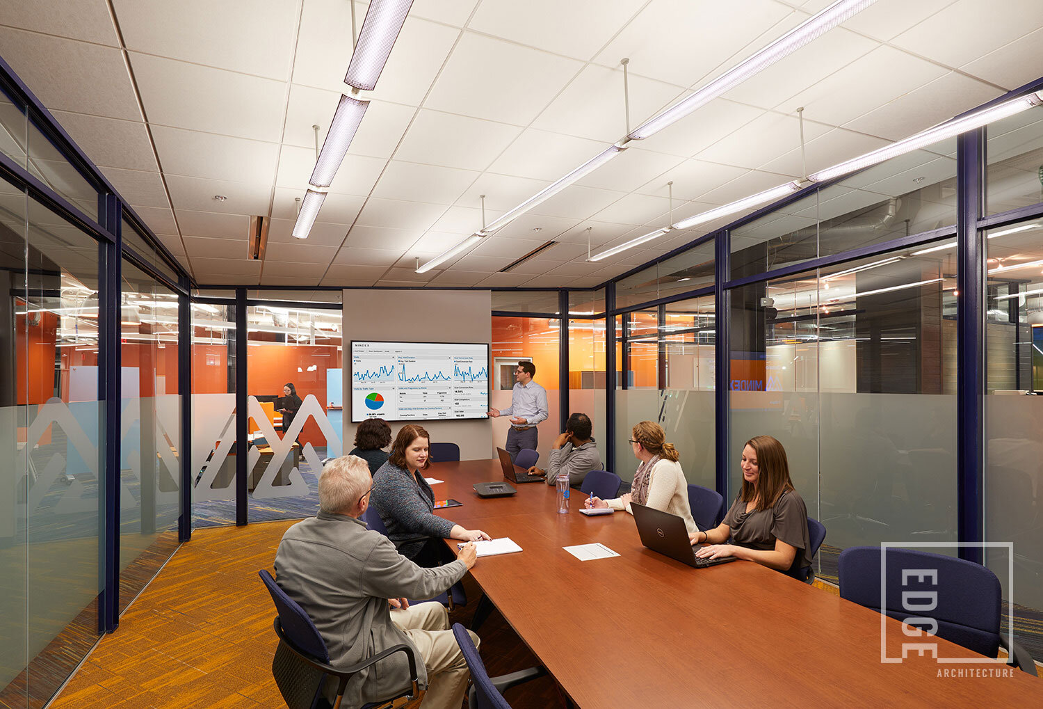
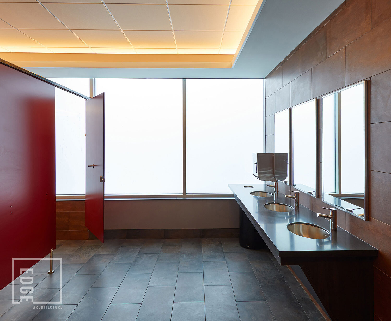
Mindex’s previous office had very little natural light, so overcoming this was one of the guiding principles of this design. Every space in the new design had to have access to ample natural light, not just window-side or corner offices. Certain areas proved tricky to include in this commitment, but Edge found a solution by using glass walls, delivering “borrowed” natural light to fully interior spaces.
The front porch provides outdoor employee space in the very front of the building, and compliments the architectural style of nearby structures. This addition provides an alternative space for enjoying lunch with colleagues, taking a break, or for bringing work outside.
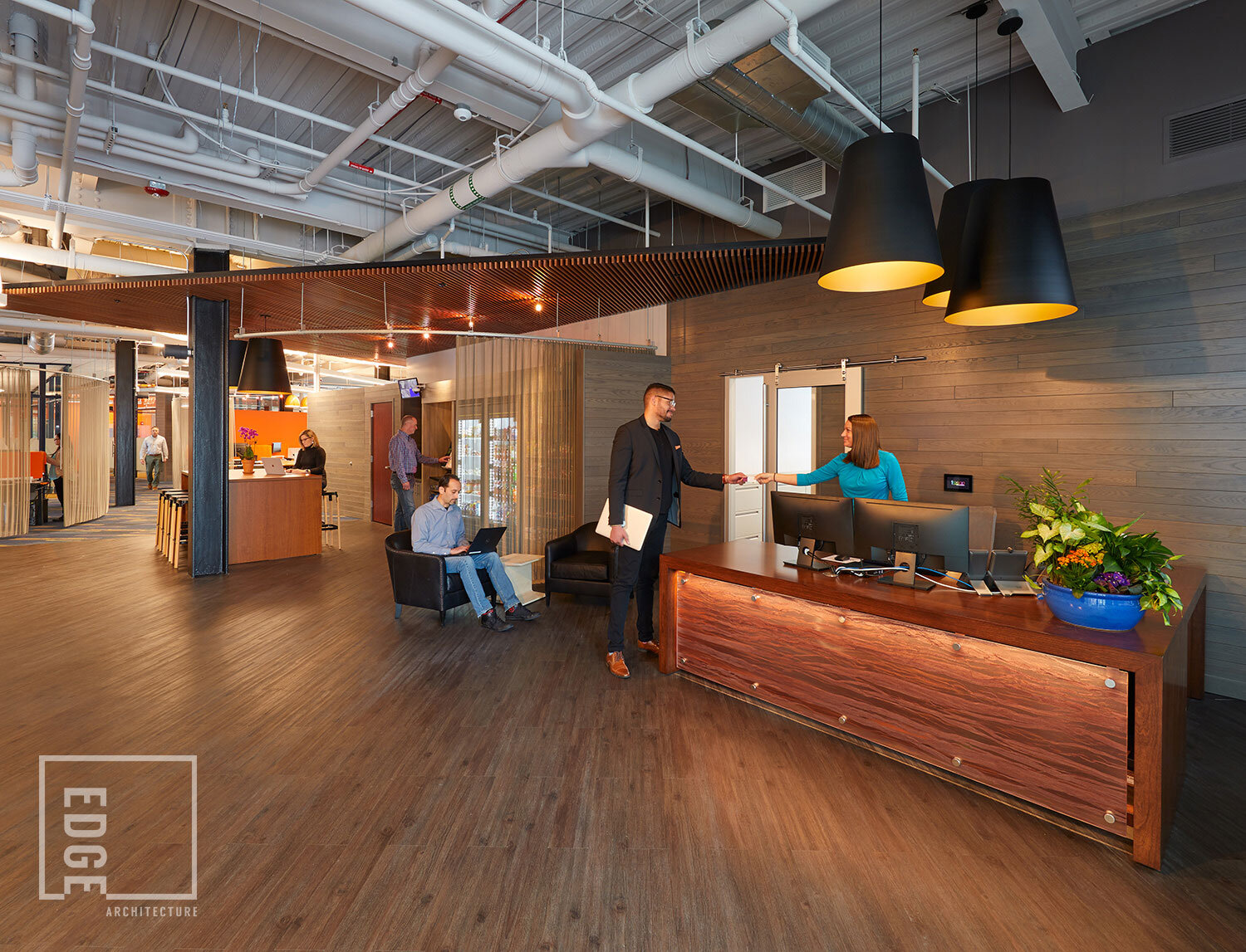
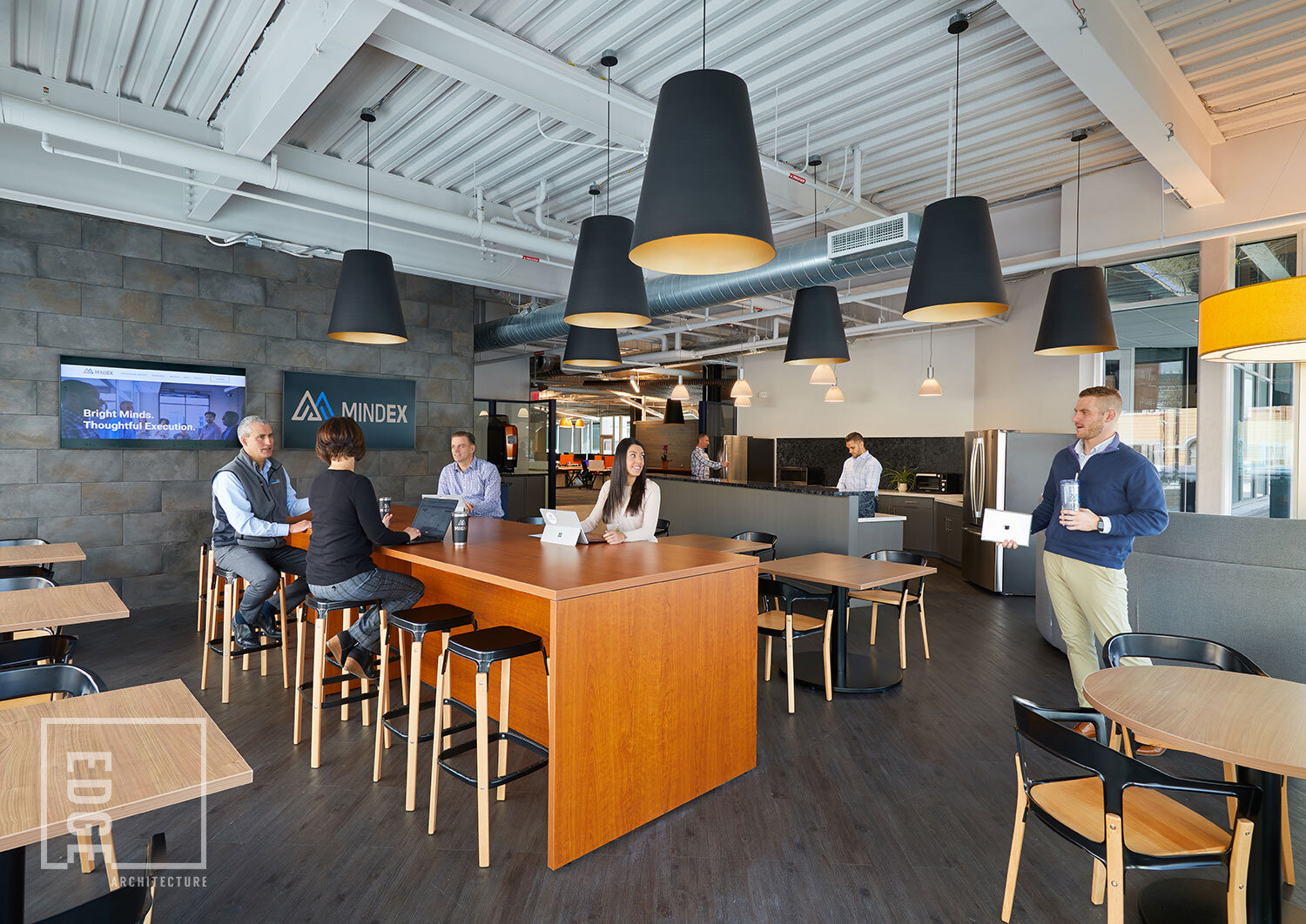
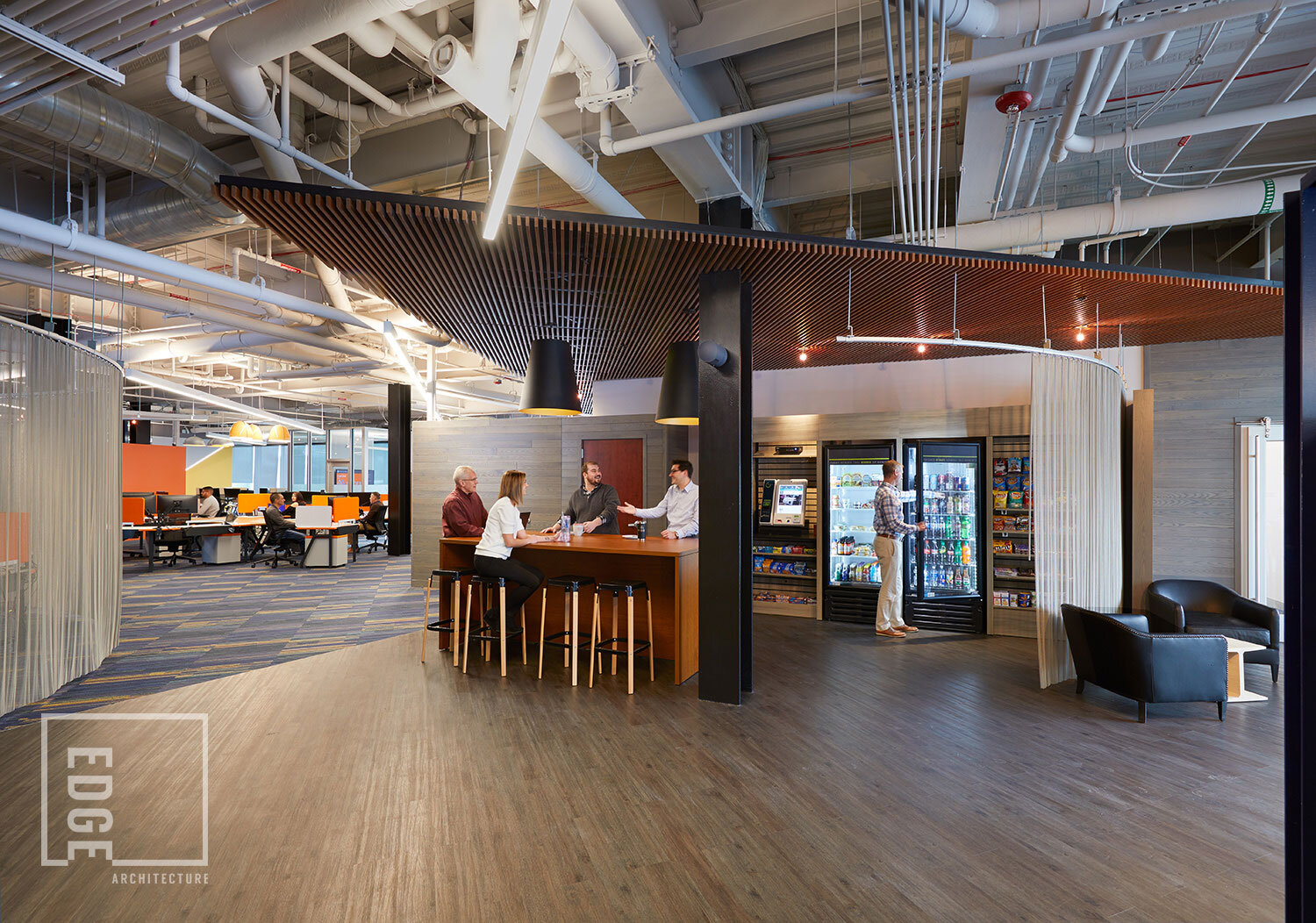
Flexible collaborative spaces were also an important feature. Alternative seating options for individual or collaborative work, large and small conference rooms, scrum rooms, and even a mother’s room were all incorporated into the final design. The kitchen was designed to be as welcoming as possible, with full views of the hustle and bustle of the street outside; providing a place to socialize, have a cup of coffee, prepare food, or have an informal meeting. The vending area offers an additional impromptu meeting area, with multiple machines filled with healthful options.
“Edge really took the time to learn about our company and employees to know what kind of work environment they would enjoy the best. I love, it, our team loves it, we couldn’t be more pleased with the results!”
Employee-Centered Design
The intention of the design was to provide Mindex employees with spaces they want to be in. Comfortable, welcoming and exciting, this new space is the physical manifestation of the success Mindex has delivered to its clients for more than a quarter-century.
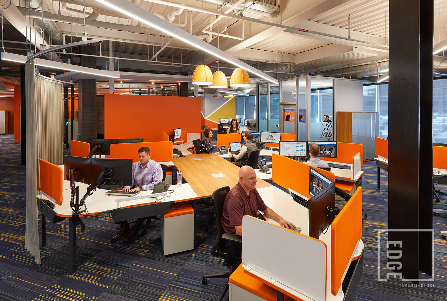
In order to garner a proper understanding, Edge held design meetings with employees to identify individual work styles. One result of these meetings was the inclusion of custom-designed "pin-wheel" desks that promote teamwork and flexibility. Other design features considered important were: white board areas for brainstorming, digital interfaces, versatile lighting controls, window shades, and privacy rooms.
It was also felt a connection between indoor and outdoor spaces was important, given the urban environment. Using the concept of a restaurant for inspiration, the break room and outdoor patio were conceived accordingly. The future space between the proposed next development was also considered for its park-like design aesthetic linking the sidewalk to the interior courtyard parking.
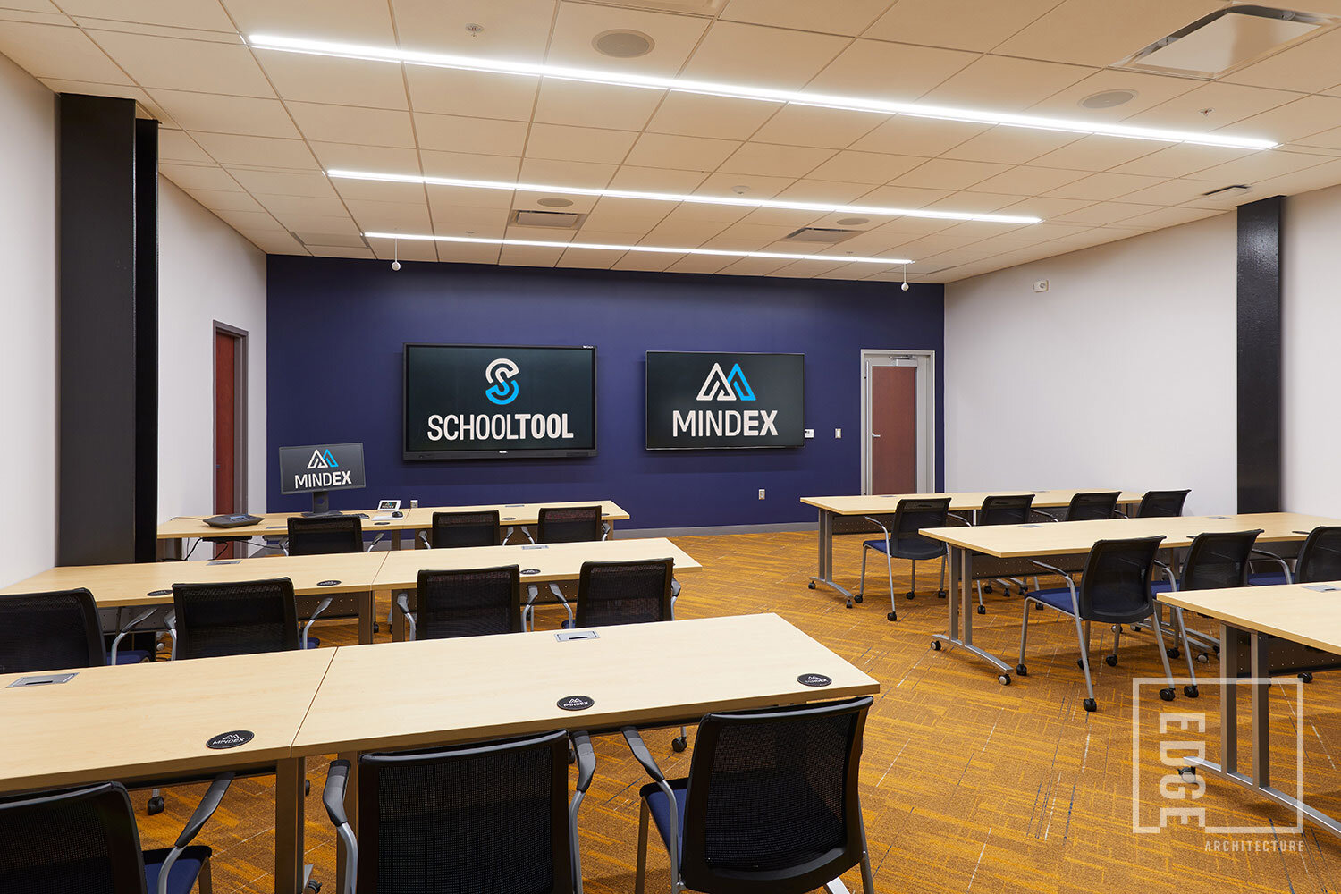
As a technology company, Mindex felt weaving tech into the design was key. Throughout the space… technology is everywhere. Digital screens are available in each room, meeting rooms each have digital control pads for scheduling, and mobile work is encouraged with ample power stations and strong wi-fi.
